Designing Google Posts with Canva
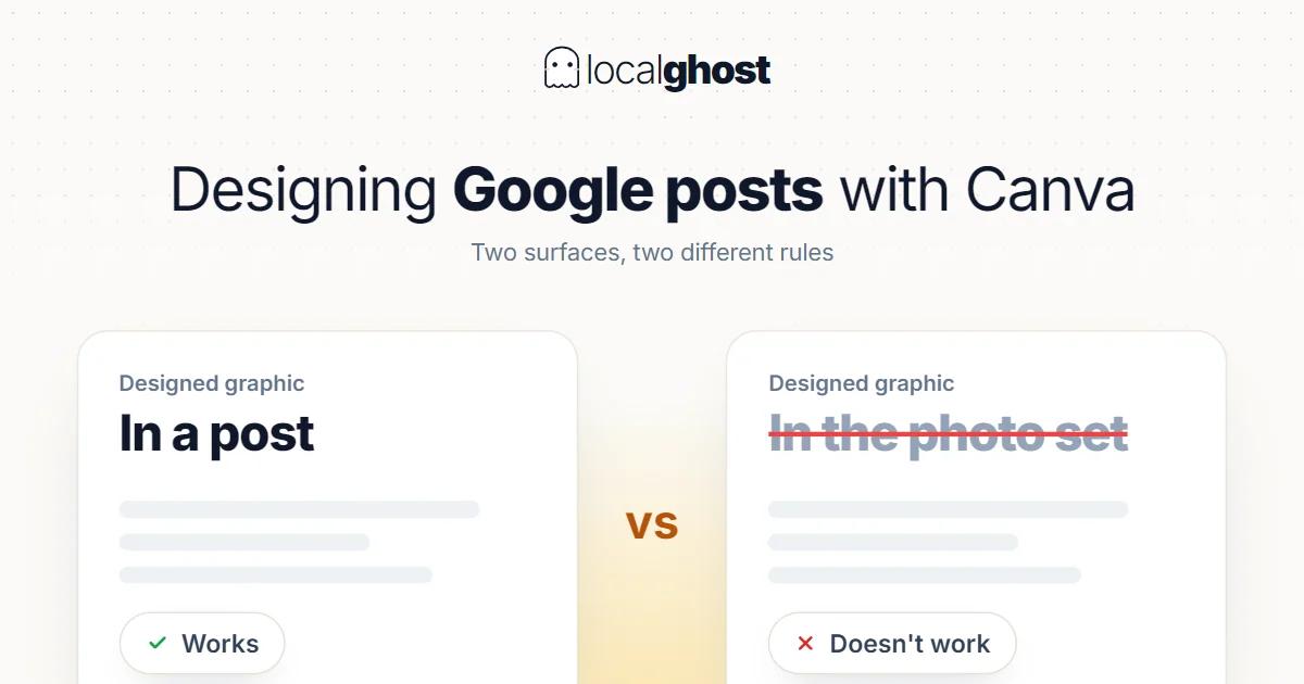
Designed graphics work in posts, not in the profile's photo set. Knowing the difference prevents wasted effort.
In this article
Summarize with AI
When preparing Google posts with a design tool, one question usually goes unasked: what will this image accomplish on the profile?
Left unasked, the result is this: a graphic with a price, promotional copy and a phone number printed on it gets uploaded to the profile, where it looks out of place. Because a profile is not a billboard; it is where a customer looks for an answer to "should I go there".
This piece draws the line: designed visuals work in posts, real photographs win in the profile's photo set.
Two different surfaces, two different rules
There are two places a visual can sit on a profile, and their rules differ.
The photo section. Permanent. This is where customers see the place, the product and the work. Google's advice is to add category-specific real photos, and it notes that an exterior photo helps customers recognise the business when they visit. A designed graphic does not do that job: photo optimization.
Posts. Time-bound. Per Google's documentation a post can contain a description, a photo, a video and an action button with a link. A designed visual makes sense here, because the content is an announcement: how to schedule posts.
The rule becomes clear: real photographs for the permanent surface, design for the time-bound announcement.
Post types where design genuinely helps
Here a design tool provides real convenience, particularly for recurring content.
Season opening and closing notices. A template carrying dates and hours, used twice a year: profile management for seasonal businesses.
Changing prices and stock. The week's produce for a wholesaler, the price per kilo for a scrap buyer. Setting the template once and changing the number weekly reduces the job to minutes: wholesale food suppliers.
Holiday and special-day information. Announcing a closure or different hours: hours optimization.
A new service announcement. Making an addition to the service list visible.
Events. If something has a date and a time, a post is the right place.
The common thread: all of it is time-bound and information-carrying. Design done for decoration is not on this list.
Where design does not help
This list is where most of the effort spent in a design tool actually goes.
The main photo set. Photos of the place, the product and the work should be real. A graphic does not give the customer the information they came for.
Using stock imagery. A photo of somewhere else, or a generic image, does not show your business and carries removal risk.
Posting review screenshots. Turning a customer review into a graphic is both a personal data issue and redundant: the reviews already sit on the profile.
Stacking text. Long text squeezed into an image does not read on a phone. Text embedded in an image is also not machine-readable and is inaccessible to anyone using a screen reader — the information needs to be in the post copy.
Printing contact details. Phone and address already sit in their own profile fields. Putting them on an image is duplication, and when they change the image keeps the old version.
The right behaviour around size and cropping
Recommended dimensions for post and photo images change over time, and the numbers online are frequently out of date.
So rather than quoting figures, a behaviour: check Google's current help page before uploading.
Three rules that do not depend on a figure stay constant:
Leave safe margins at the edges. The same image can be cropped differently across surfaces. Text or a logo near the edge gets cut.
Centre what matters. Cropping mostly happens from the edges; the important element belongs in the middle.
Test on a small screen. Text that reads on desktop does not read on a phone. Opening the finished design on a phone takes five seconds: mobile-first SEO.
Building a template: this is the real gain
The genuine benefit of a design tool is not producing one attractive image but building a repeatable template.
A template built once carries: brand colour, typeface, logo placement, and clearly defined fields to change. After that, each announcement takes five minutes.
That has two side benefits. First consistency: posts resemble one another and the brand becomes recognisable. Second delegability: with a template, the result does not change when the person preparing posts changes.
In a multi-branch structure this matters more — with one careful limit: the template can be central, but the photograph inside it must be taken at that branch. One central image distributes the same view to every location and the branches become indistinguishable: multi-location management.
Post copy does more work than the visual
Pouring effort into the image and dashing off one sentence of copy is the most common imbalance here. Yet the copy is where the information actually travels.
The reason is technical: text embedded in an image is not read — not by machines, not by screen readers. If what the offer is, when it applies and what to do about it are not in the copy, they are nowhere.
The structure of post copy that works is short:
The event in the first sentence. What is happening. Because the full text is not visible on mobile, the first sentence decides.
Concrete detail. Date, time, duration, price range. Not "don't miss out" but "Saturday 10am to 2pm".
One action. Call, get directions, book. Adding two actions weakens both.
The right page behind the action button. Google's documentation asks that the button lead to a page where the action can be completed. A "book now" button landing on a homepage loses the high-intent user: website SEO for local businesses.
Using the customer's own words in the copy helps too; industry terminology finds no match on the search side: local keyword research.
Throwing an Instagram visual into a Google post
This is a common shortcut and it usually does not work well.
The reason is that the two platforms do different jobs. On Instagram a visual exists to catch attention; in a Google post it exists to carry information. A busy, heavily styled image designed for Instagram looks foreign on a profile.
There is a format problem too: a square or vertical Instagram visual can get cropped on the post surface, cutting the text.
The same applies in reverse: an information-led image made for a Google post looks dull on Instagram. Preparing separate visuals for the two surfaces does not look like less effort than reusing one, but the result is noticeably better: Instagram strategies for local businesses.
What comes before design
A caution to close with, because design is often work done too early.
Post visuals get in the queue after the profile's fundamentals are done. If the category is wrong, hours are missing or review flow has stopped, an attractive post graphic does not compensate.
The order that comes first: correct category, complete information, accurate hours, real photographs, review flow. Post design comes after those: 10 golden rules.
Posts also have a short life. If the energy available is limited, that energy spent on review replies and photo flow returns more: weekly maintenance calendar.
Frequently asked questions
Can I use designed visuals in Google posts? You can, and it makes sense for time-bound announcements. But in the profile's permanent photo set, real photographs win.
Can I upload graphics as profile photos? Better to use real photographs instead. Google recommends category-specific real photos, and an exterior photo helps customers recognise the business when they arrive.
What size should the image be? Recommended sizes change; check Google's current help page before uploading. The constant rule: leave safe margins and centre the important elements.
Can I print the price and phone number on the image? Better not to. Text embedded in an image is not machine-readable, is inaccessible via screen readers, and goes stale when the information changes. Put it in the post copy.
Can I reuse my Instagram visual in a Google post? You can, but it usually looks wrong: the format gets cropped and a busy Instagram design looks foreign on a profile.
Can branches use the same visual? The template can be the same, the photograph should not. The image inside it must be shot at that branch, or the branches become indistinguishable.
Written by
Yunus Akan
Related tools: Content calendar · Photo GPS tagging · Profile analysis · All local SEO tools